
The initial idea
Law has a very typical idiom. Law firms often use cold colors, a lot of texts with complicated words and images of grand men in suits. We wanted Signat to have a softer appearance, with a nice tonality and a well-designed UI & UX. Signat’s primary mission was to explain law in a simple and intuitive way – with colors, icons and illustrations on the front end. On the back end, we wanted the process to be fully automated with minimal administration.
Signat’s three main parts:
Project Tools


Technique
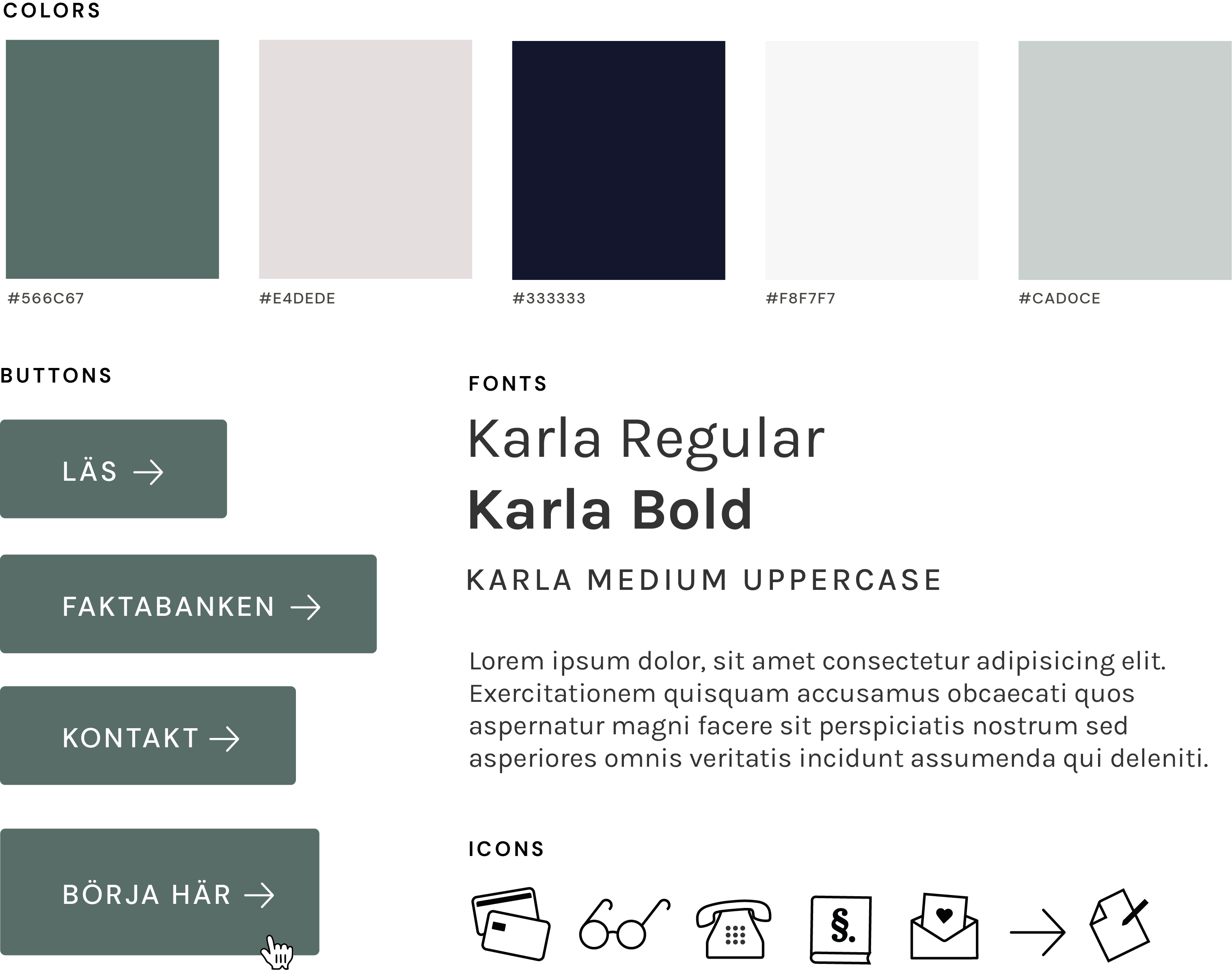
Style Tile
1. FAQ-library
The main reason for having a FAQ library was Google. Firstly, we analyzed and picked different keywords that could lead to customer conversion. By looking at existing pages with high rankings for these keywords, I designed the FAQ pages in a similar basic structure (length of text, pictures, etc). We also used breadcrumbs, categories, backlinks and other tools to make the FAQ library as SEO-friendly as possible.
Through Google Analytics, we calculated that around 25% of our customers were organic visitors.
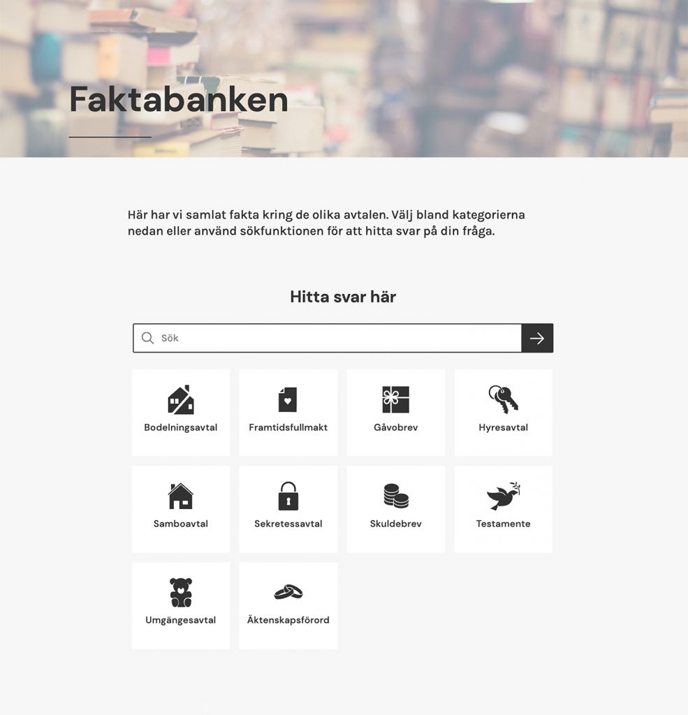
Components
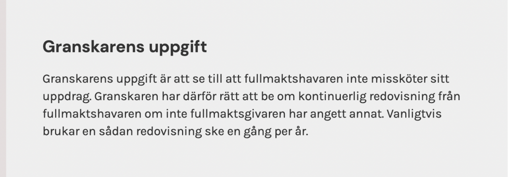
On average a person spends 37 seconds reading an article or blog post. Most users scroll through the article, gain a couple of takeaways, then leave. Instead of writing a wall of text (which lawyers tend to do), I designed and coded different components such as lists, information boxes, highlighted backgrounds and headlines with icons. By breaking up the information by using these components, the content became more accessible to the scrolling user.
The components were coded as ready-made blocks, to make it easy for anyone to post content (which was our SEO strategy – to publish a lot of content) without doing any design work.
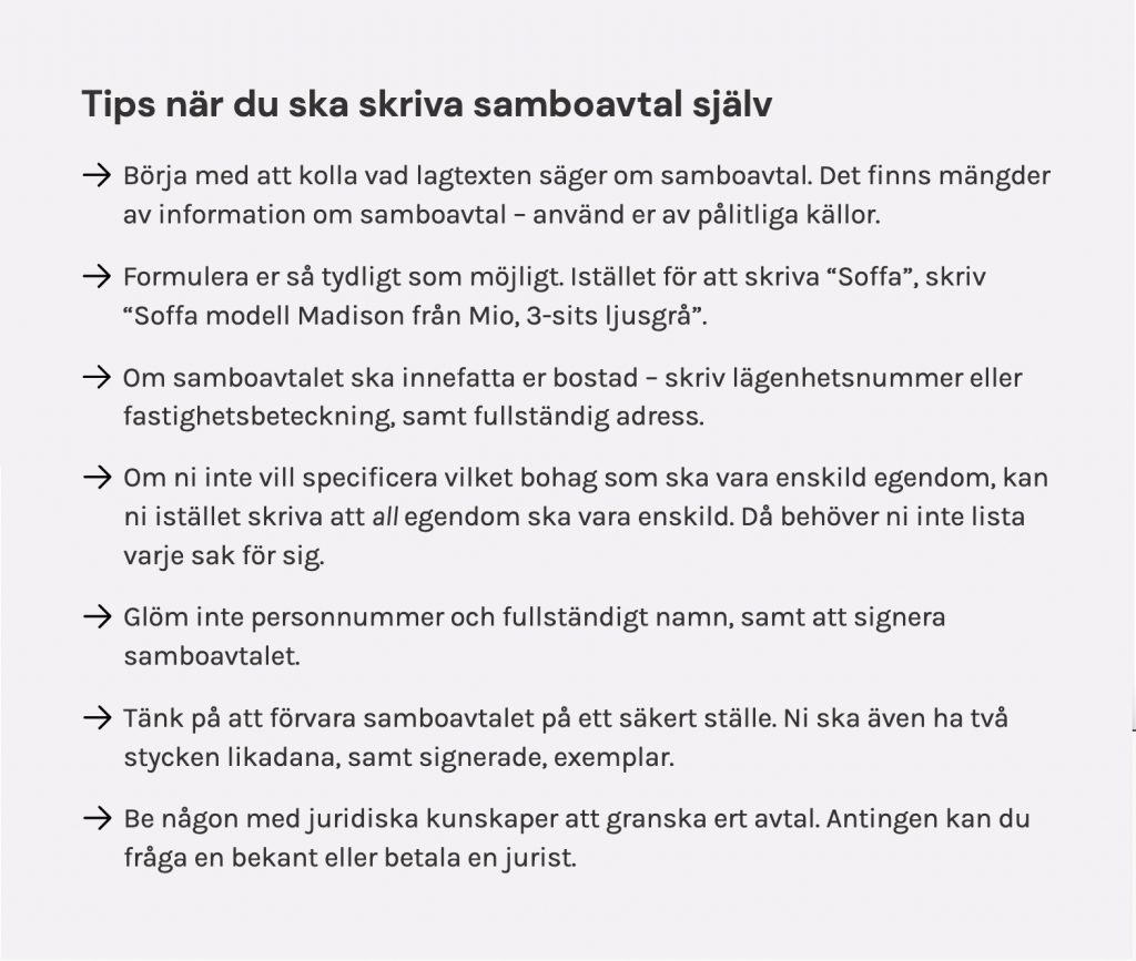


Illustrations
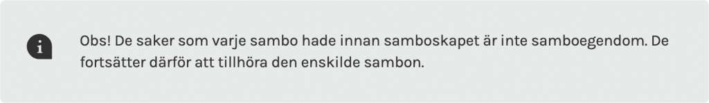
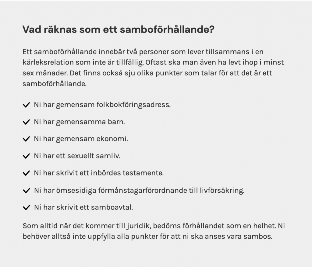
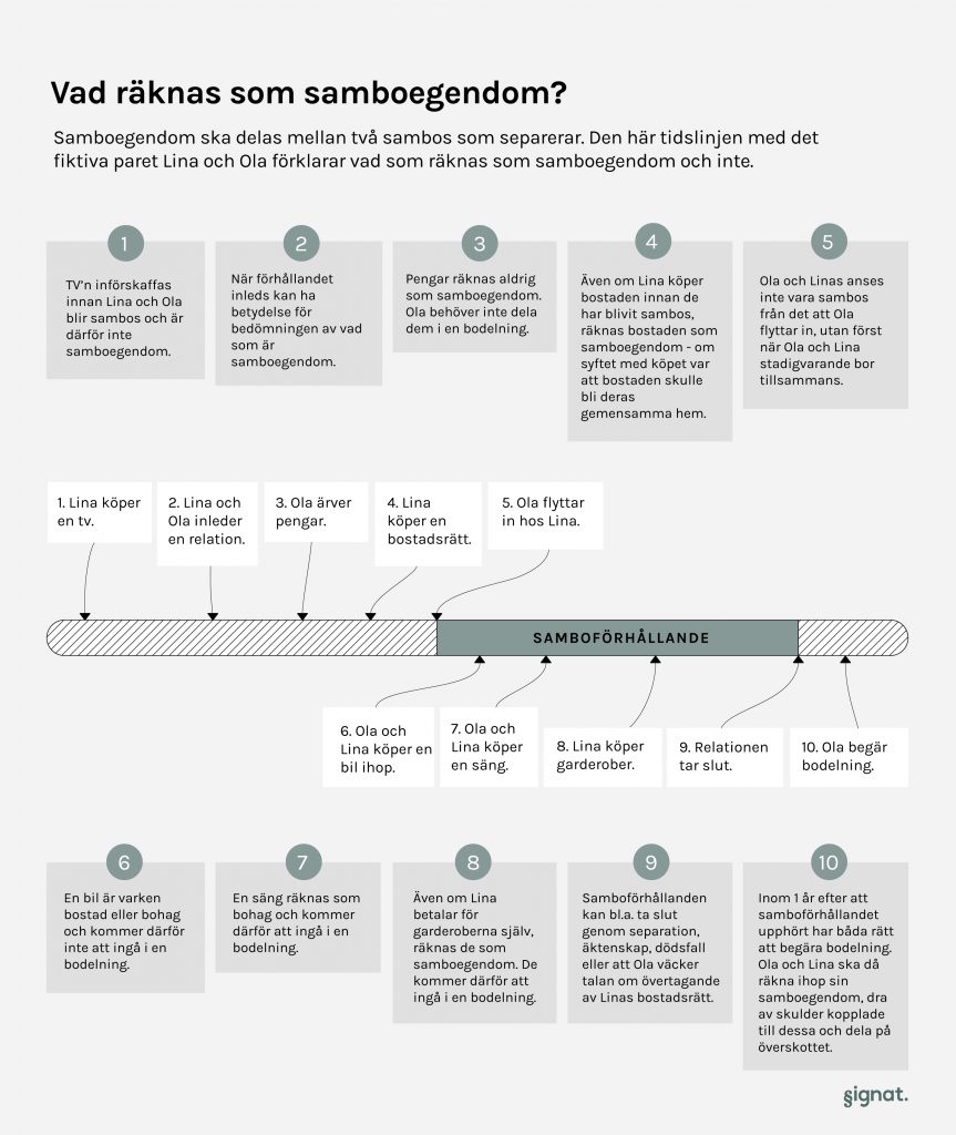
There is no getting away from the fact that law is complicated. To make law easier to understand, I illustrated different scenarios linked to the legal subject.
The context

Shared property explained
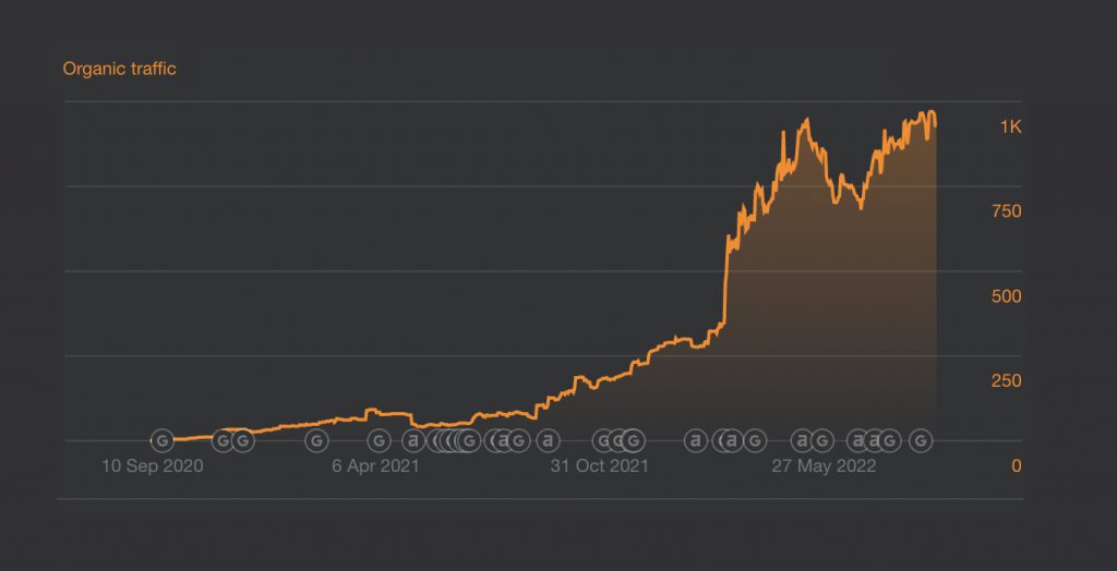
The result
Printscreen from Ahref, measuring the traffic from September 2020 to September 2022.
2. The Contract Service
Our ambition was to make our contract service as simple as law could. In the contract service, every legal term is explained, some options are illustrated with icons and we also tried to avoid the legalese language. This was where the customer conversion took place, so this step was the most crucial for our UX design.
Example

A/B-tests
We analyzed user behavior by using Hotjar and Google Analytics. The wanted result was of course that the user fulfilled the contract service and bought a contract. By testing different versions, letting test persons buy contracts through our service and interviewing old customers, we came to many important conclusions.
We also discovered that many of our hypotheses were not correct at all, while some random experiments increased conversion significantly.
Examples of conclusions we got from AB-tests and interviews
- Inform the user on the first page what personal information they need to use the contract service (personal security number, addresses, etc).
- Inform the user how long it would take to use the contract service.
- Divide the contract service into different pages, instead of having a longer one page-form.
- Use a progress bar on top of the contract service so the user can follow the process.
- Offer a ”save and continue later” button, without registering an account.
- Formulate the contract service questions in an easy and non-legal way. (But not too easy, we learned the hard way.)
- Use tooltips to explain inevitable complicated legal terms.
- Populate fields dynamically by using their surnames.
- Have buttons where the user can come in contact – via email or phone.
- Have free legal advice over the phone, which increased our credibility.
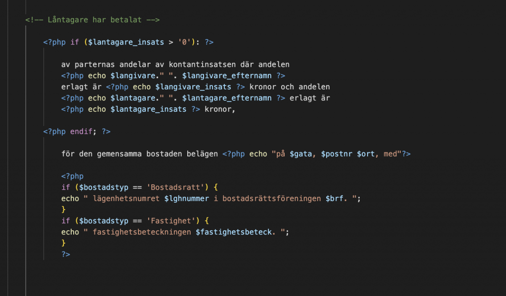
3. The Contracts
By using Gravity PDF and customized templates, the final contracts were automated. For example, if a user clicked on ”the property should be divided 50/50”, I coded the correct legal term into the completed contract. The contract was then downloaded to a PDF and manually sent to the user.
The code
After over 100 sold contracts and many different legal scenarios, the code was refined to fit most of the unique situations of our users. I also made it possible for the lawyer to freely reformulate certain legal terms (when needed) inside WordPress, without rewriting the code.
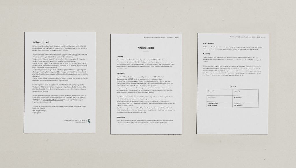
Final product
When the user clicked the ”send” button, a PDF was created with the final contract. The lawyer always reviewed the contract manually, before sending them to the customer.
Wanna see more?
Check out Signat.se.