Initial design
Åsa and Margareta had many returning customers but needed to expand their customer base, for several reasons. The website rarely converted any new customers, instead most of their new bookings came from Bokadirekt.se.
Current website
With a heuristic method, I reviewed their current website and listed general improvement areas and obstacles. Together with Åsa and Margareta, we discussed my conclusions and what they wanted to achieve with the new website. I saw several connections between my insights and their own experiences.
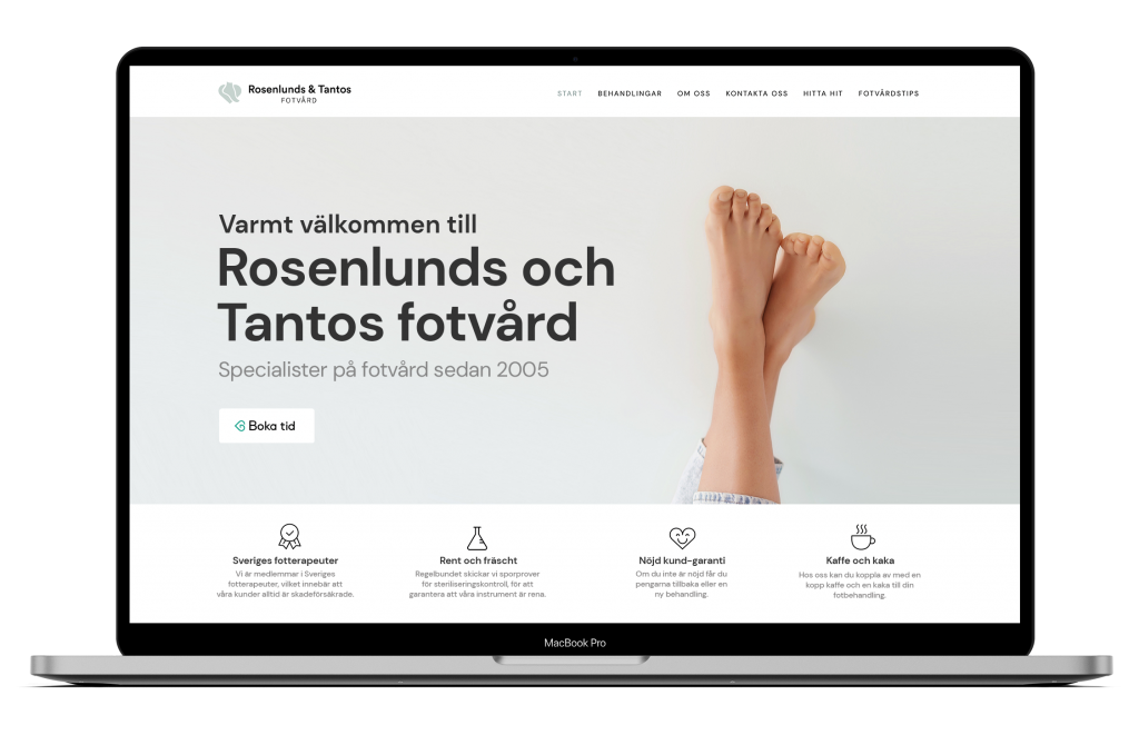
The over all-goal with the new website was to give a better presentation of Åsa and Margareta, increase their organic traffic and hopefully get new customers. We listed the most common questions and misunderstandings from customers, how their bookings were made, how customers got in contact, how customers got to the clinic. By mapping statistic data of the website, how the website was used at the moment, how the website could be made more useful, I came up with various areas of improvement.
Improvements
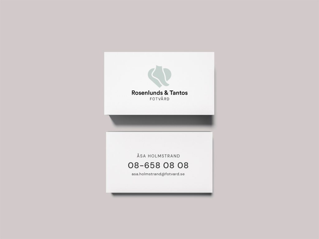
- New logo and graphic profile.
- An overview of their treatments.
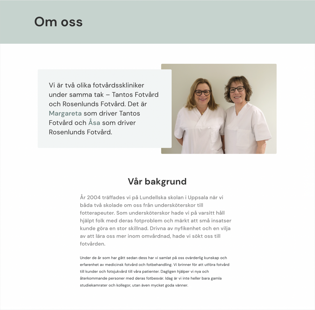
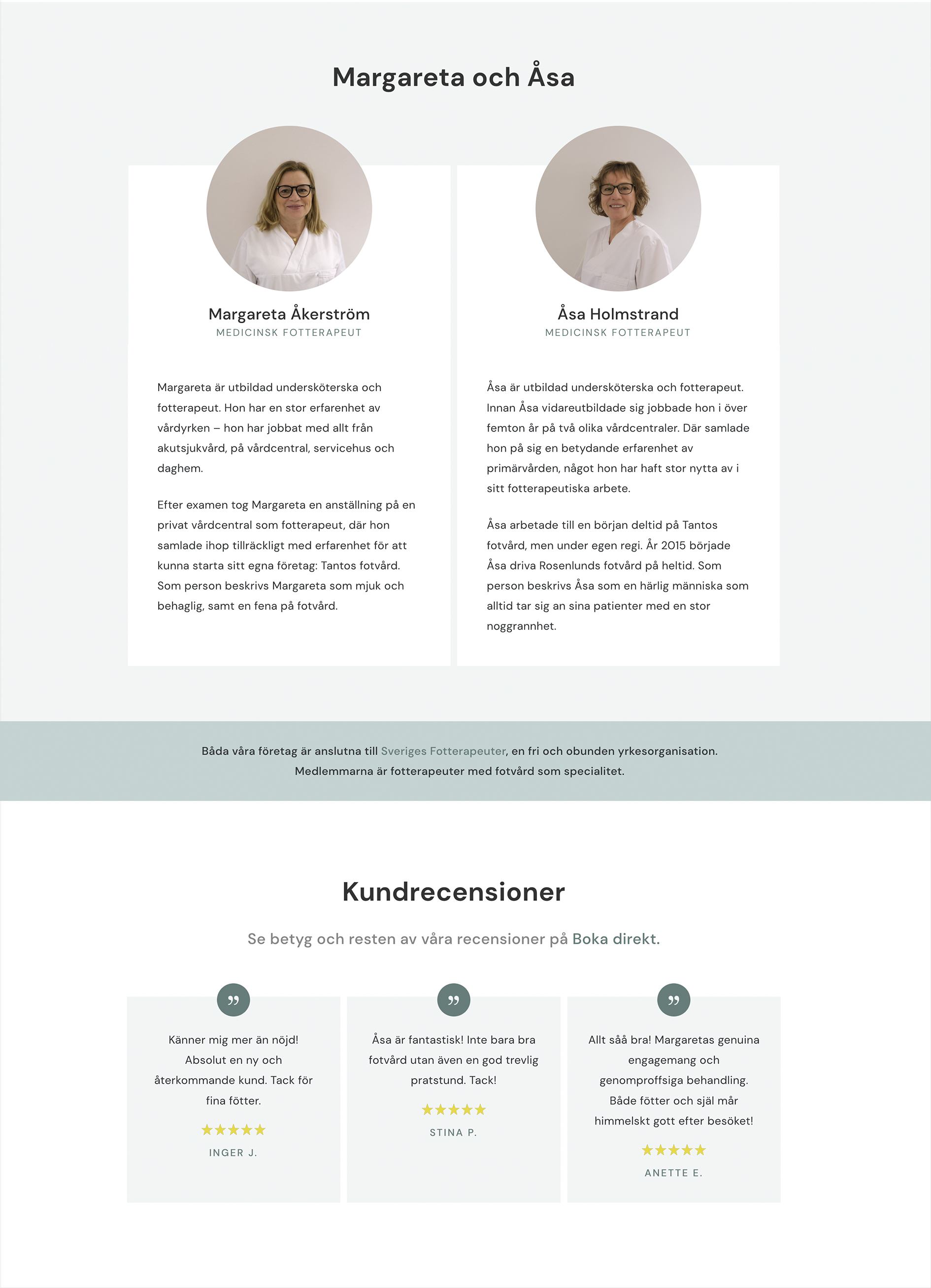
- Better presentation of Åsa and Margareta.
- Well-placed CTA buttons.
- Use their good reviews to show credibility.
- A contact form and an official common email address.
- Answer common questions.
- A map of how to get to the clinic (this was a big problem).
- More organic traffic from Google through foot care content.
- Redo their business profile on Bokadirekt, where the final conversion takes place.
Style Tile
Åsa and Margareta are not only two excellent podiatrists, but also very warm and friendly human beings. The first impression of the website was meant to feel ”fresh” and professional with a friendly tone. By using soft colors, a cute logo, smiling pictures and a nice tonality in the texts, I wanted the website to be like Åsa and Margareta.

The logo
Åsa and Margareta had a very pixly logo, which was only used on the website and not on their business card or in the clinic. The new logo is designed according to the principle of the golden ratio. The color of the logo is their main color, according to their new graphic profile.
I made three different versions and this was the logo Åsa and Margareta agreed about.
Logo Example
Content
All the content on their old website had to be updated and developed. I rewrote all their texts and divided the information into a new site structure. Here I worked a lot with the tonality and trying to portray Åsa and Margareta and their services in a profesional and descriptive way.
Presentation
Even the pictures were a decade old. I took new portrait photos, group photos and photos of the clinic. I rewrote their personal stories based on their customer’s reviews and their resumés. Åsa and Margareta had more than a hundred positive reviews on Bokadirekt.se, which I of course added to their About-page.
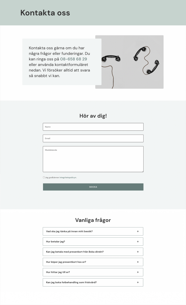
Get in contact
Their old webpage lacked a contact form and they had two different email addresses. With a contact form and a shared email, all their emails were finally sent to the same place. Their customers usually asked the same questions, so I gathered the most common questions into a FAQ box.
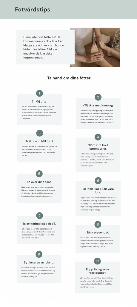
To at least get a small chance on Google, I added the page ”Foot care tips” where I compiled some foot health advice in list form.
The result
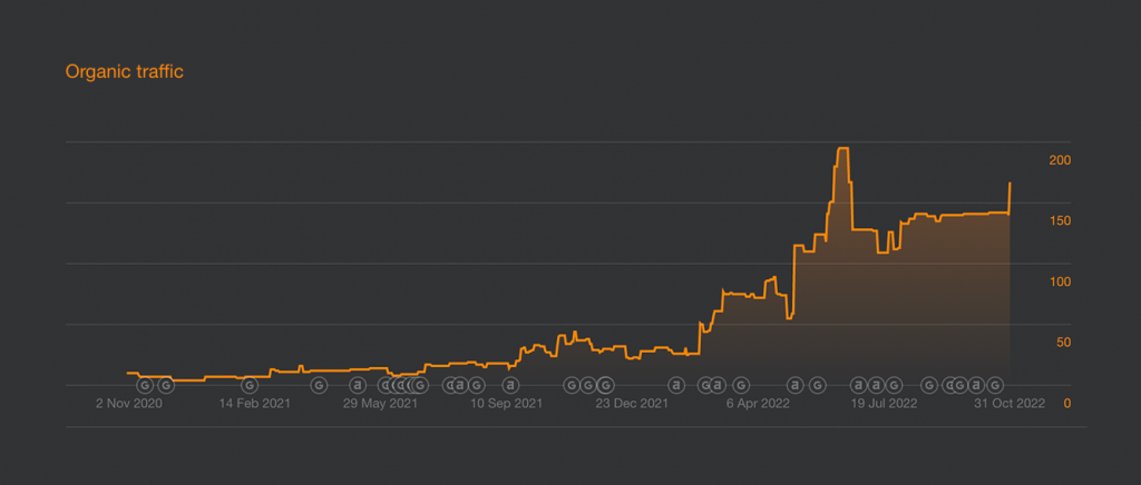
Picture from Ahref, measuring organic traffic. The traffic has increased 4,5 times since the launch of the new website in march 2022.
Wanna see more?
Check out Rosenlunds & Tantos fotvård.